Our Font
For our OTS we decided to use a basic font style. We chose this because we thought that the basic font was very easy and legible meaning no matter how long the text lasts for on the screen it can be easily read and understood by the audience. We thought a basic font would be better than any 'fancy' looking font because some fonts just wouldn't match our horror theme and would then be harder to read by anybody watching it.
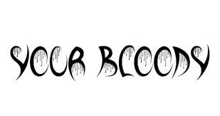
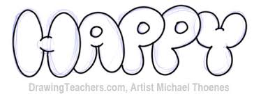
The font choice is also incredibly important because it also allows for the audience to get a brief idea of what the film will be about. for example if the title font is in the style of bubble writing then they could interpret that its going to be a comedic film. however if the font is spiky or misshape then they could put together that the film is going to include a lot of horror or psychological influences.


